Plakatstil
Plakatstil is a design aesthetic defined by isolated objects, flat colors, bold lettering, worked in a palette of simple, bold color palettes with high contrast. Associated with the 1900s, Plakatstil leans toward clarity, directness, modernity. Related looks include Bauhaus, Constructivism.
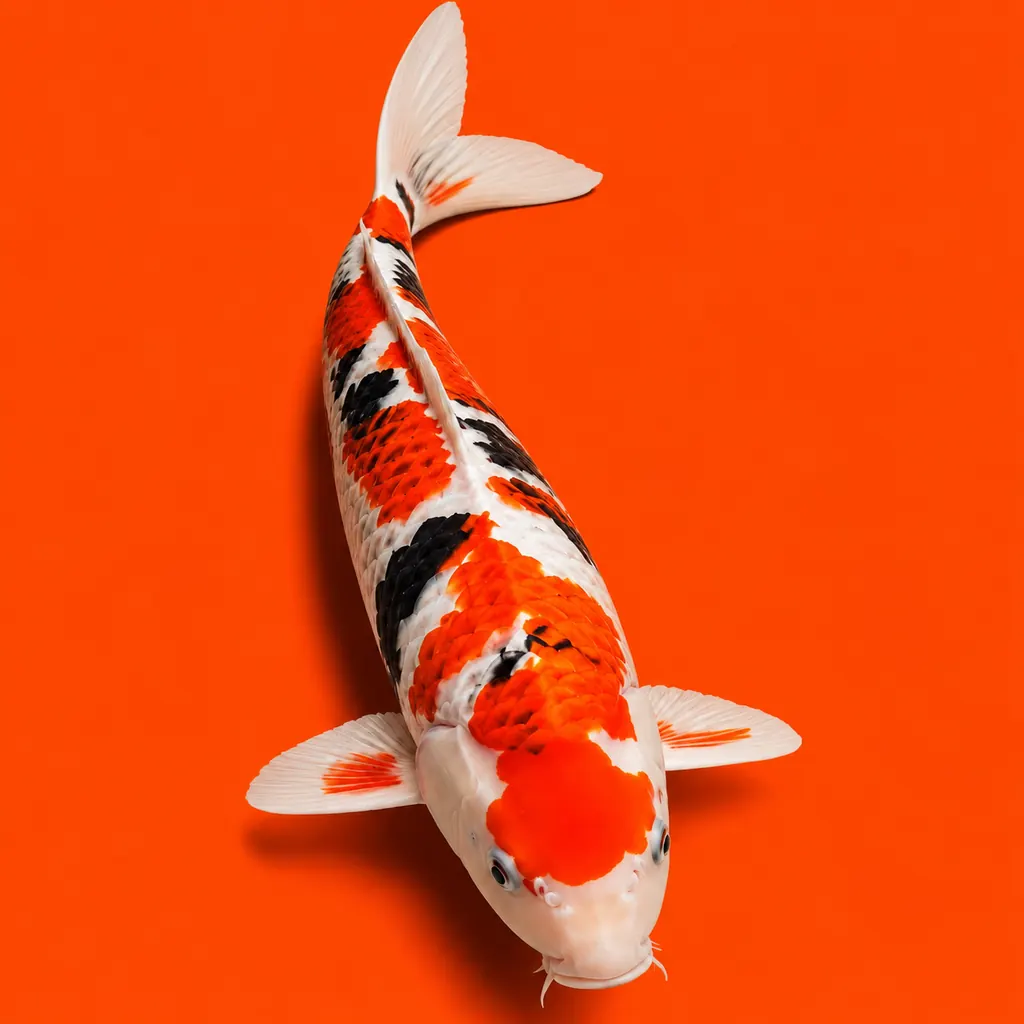
AI image prompt
Plakatstil aesthetic — Isolated objects, flat colors, bold lettering, negative space. Colour palette: Simple, bold color palettes with high contrast. Mood: Clarity, directness, modernity. Highly detailed, rich colour and texture, evocative mood, high quality.
What it is
Plakatstil is a design aesthetic built around isolated objects, flat colors, bold lettering, negative space. The Plakatstil palette works in simple, bold color palettes with high contrast. As a named look, Plakatstil is most associated with the 1900s. Beyond the essentials, the Plakatstil look leans on lack of ornamentation and related details — 5 recurring motifs in all. In feeling, Plakatstil reads as clarity, directness, modernity, readability. Plakatstil sits within a family of related looks such as Bauhaus, Constructivism. Additionally, to recreate Plakatstil in an AI image tool using GPT Image or Midjourney, pair simple and bold color palettes with high contrast tones with isolated objects and flat colors, and keep a clarity mood. For example, Plakatstil pairs naturally with Bauhaus and Constructivism on a shared mood board.
Motifs
Isolated objects, flat colors, bold lettering, negative space, lack of ornamentation
Mood & values
Clarity, directness, modernity, readability, impact
Related vibes
More vibes every week
Vibeboard is a free visual reference. Bookmark it, and copy a ready-to-use AI image prompt from any vibe.
Browse all vibes →